I started out the Illustrator of the Month feature as a place to talk about great illustrators who I came across in my work that I couldn't use on products for various reasons. As time went on the reach of 'Illustrator' seemed a bit short, after all, where does Illustration end and Art begin? Doesn't fine art illustrate ideas at times too?  It's been easy for me to talk myself into keeping it as Illustrator of the Month even when it should have been correctly titled "Painter of the Month" or whatever, cause painting and illustrating aren't really that far off from one another when you get right down to it.


But I'm in a bit of a conundrum now. I've got a new job at an art gallery and I'm encountering all sorts of different art in my job and less illustration. Of course I'm totally inspired and loving studying art history again. That said, I still love illustration, so I don't want to abandon it as a post topic entirely and beyond that I plan to get my ass in gear and do some more of my own illustrations again soon - it's been a long while since I did a series. So I want to stay immersed in illustration, but I keep coming across other awesome artists I want to feature who aren't illustrators.

Alas dear readers it's my blog and I can be inaccurate if I want to. So suck it! I'm keeping the title "Illustrator of the Month" no matter what.


This month's Illustrator Artist of the Month is actually a photographer. Alexandra Catiere is a fine art photographer born in Belarus in 1978. She studied in Russia, then studied and worked in New York (apprenticing under Irving Penn, no less) and now lives in Paris. Her work has been shown internationally in fine art forums such as gallery shows, but it is her work for the fashion industry that really grabs me.


Perhaps it is her background in the fine arts that lends such a lovely artistic quality to her images. They are painterly and her use of colour and light is overwhelmingly beautiful. Doesn't this one at left remind you of the Dutch masters?


I was immediately reminded of Vermeer's Girl with the Pearl Earring.


It should come as  no surprise that Catiere is constantly working - The New Yorker, The New York Times, Le Monde, Dazed & Confused, Gentelwoman, American Photo and Crash magazines have all featured her work recently.

Check out Catiere's award-winning fine art photography series Behind the Glass (2005).

Check out Catiere's work for Crash magazine inspired by Grey Gardens.(2009)

Check out Catiere's work for the NY Times blog - a series of pics from Paris Fashion Week (2010).


Check out Catiere's series for Lurve magazine, it's eerie and called Stairway to Heaven (2010).
I've been itching to be more involved in my community for the past few years. With commuting and multiple businesses on the go, it's been difficult at best to become involved. But, I have a new job, and not only does it free up some of my time (for important things like sleeping, painting, blogging and cooking) but it also allows me to be involved in my community as part of my career. Sweet!

When I was a kid, I didn't appreciate my home town at all. I thought it sucked. I would have used the word "sucked" with extreme emphasis. I don't claim to be the most worldly person ever, but I have learned as an adult that in fact, my hometown doesn't suck at all. In comparison to a lot of other places I've lived, it's actually pretty vibrant for its size and close proximity to a major metropolis (Toronto). Cities around the globe that live in the shadows of a major city often suffer similar fates - the residents see it as more desirable to travel an hour for a meal and gallery opening in the big city - making it difficult for culture and unique features to evolve at home.

In my new job, which is doing a  number things for The RMG (The Robert McLaughlin Gallery in Oshawa) I've had to do a some research about art history in relation to the city. As it turns out, there is actually quite a legacy of important arts movements in Canada based in the town. One example being that the first abstract art exhibit in Canada took place in Oshawa. Who would have guessed? Even reporters commonly say it was "outside Toronto" or "east of Toronto" but don't give the actual city name. It's fascinating to learn about and I hope to continue to support community building efforts in Oshawa. I've been mentally using the slogan "Oshawa, Why Not?" as my own motivational tool, thinking, why not imagine Oshawa could fix its bad reputation? It is partially because I'm very stubborn, and I refuse to let malls and big box stores ruin what has the bones to be an awesome, vibrant downtown core.

I thought I'd blog about some recent goings-on in support of my new-found appreciation for my city. It's got one of the worst reputations of any city in Ontario yet I personally believe this is largely to do with the actual residents of the city perpetuating the stigma rather than anyone outside of the city reinforcing it. It has blemishes, but what city doesn't? When people tell me there is 'nothing to do' I'm left wondering what it is they are seeking, because I find more than enough things to do. 

At very least I figure there's enough people out there saying negative things, I might as well go against the grain and say positive things.

One of my favourite things about Oshawa is the choice of two great flea markets. One is at the north end, and one is technically in Courtice, but they are both pretty awesome and about 10 minutes drive from my house.The Oshawa flea market is truly a flea market. I'm tired of these 'flea markets' that sell only collectibles, bad gold necklaces, fake purses and puppy mill dogs. Those are not flea markets. Flea markets should be full of junk, antiques, books, vinyl records and weird paintings. The odd army collectible is fine. The Oshawa flea market is vinyl record heaven - if you are a collector, there are a handful of vendors each with huge amounts to dig through, often already organized and sleeved by genre. And very well priced. I'd venture to say it's one of the best flea markets I've ever been to as far as record collecting goes. I've also bought vintage Playboy's there (I collect 50's, 60's and some 70's issues - 10 for $20), Labatt's 50 Beer Mugs  ($2 each), a W Heath Robinson poster (framed, $15) and so on. It's a fun dig-for-the-good-stuff flea market.

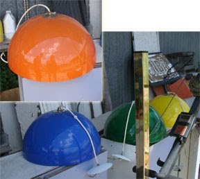
The Courtice flea market by comparison does have some crappy collectibles vendors and some lame knock-off perfumes. But, it also has a whole barn called the "Junk Gypsy", a number of antique jewellery vendors, a bunch of vintage furniture vendors, an army surplus area and a farmer's market each weekend. At left are some huge pendant lamps I spotted there this past weekend. I loved them all. Especially the orange one. Unfortunately, I couldn't even justify the $5 each they were asking for them, since I've just replaced all the lighting fixtures in my condo. But I wanted them all.


Another favourite thing about Oshawa is Fiesta Week. Fiesta Week is what Caravan in Toronto used to be before it ceased to happen. It's a festival that the cultural community halls support themselves each year by way of throwing a parade, a beauty pageant, performing traditional dance and opening up their hall kitchens to the public for a week. My whole life growing up in Oshawa I never partook in the festivities, and thought of them mostly as a place people went to get drunk underage. In spite of this I'd never been, so in the past couple of years I have made it a mission to eat at each one of the halls. (Not that I don't like pageants and parades, but even the Fiesta Week site itself says the festival could more accurately be called "Taste of Oshawa".)  The beauty of it is the food is beyond delicious - it's like eating at someone's grandma's house. Authentic and delicious. I wouldn't say Oshawa is the most multicultural city in the world, but the variety of foods to choose from at Fiesta are still pretty spectacular.
While there is Indian, Thai, Persian, Japanese, and Chinese and other various restaurants in town, there aren't German, Hungarian, Portuguese or Ukrainian places, because I suppose, that's what people eat at home. But not me! So it's different than what you can normally find, and that's always fun.

This year we started at the German hall, ate wiener schnitzel with sauerkraut and potatoes, and had a home made pretzel on the way out. The pretzel was highly memorable as it was still warm from the oven and so, so chewy. Oh yes, and some beer. 

 On to the North Portugal hall, at which we had Portuguese beer and a number of items I've never had before but will attempt to describe.
Since we'd already had a meal (we did share, but still...German food is rather heavy) we went for appetizers and desserts. Pictured are two turnovers, one with salted cod (odd, but pleasing) and one with beef (I ate it in like, half a second) as well as a custard filled pastry that literally melted in your mouth. The north Portuguese seem to be pretty into salted cod - the main dish was also a salted cod dish served hot with potatoes, black olives, hard boiled egg and onion. It looked and smelled amazing, but my hunger was waning, and I had more ground to cover.

Next we decided it was time for pierogi, so off to the Ukrainian hall we walked. They were out, which was disappointing, but not so disappointing that we didn't stay to watch the kids dance, have another beer, and eat the Ukrainian version of schnitzel with sauerkraut (darker and different from the German, but hard to put your finger on  how exactly).  Ukrainian dancing is pretty exciting. This isn't a video that I took there, but you'll get the idea. The kids are pretty awesome at it, considering they're Canadian and oh, an average of 12 years old.


Finally we went to the Italian hall. We actually started out at the Metis festival, but then it started to rain and we were hungry. We had planned to go from there to the French Canadian or Hungarian (which are the only two we haven't made it to yet, having been to the Italian, Caribbean, Portuguese, Polish and Greek halls in the past) but due to the rain we went to the closest hall. It turned out to be a solid reminder of what Italian food should actually taste like. I had ravioli, my friend had a hot veal sandwich with mushroom and hot pepper topping, and it was all so amazing. In retrospect I'm sad I didn't get arancini, because they had those too. I like food a lot and I like all kinds of food, but really, there is nothing as good as homemade fresh pasta and that is hard to resist. I really am annoyed with restaurants using dried pasta all the time. I do eat in better restaurants but even there they cheat, and it is rare to find one that doesn't - though props to Fazio's in Oshawa for being the first restaurant to come to mind when I thought of one that made their own. Anyhow it was great. Super fresh and homemade and cooked just right.

Finally if listing awesome things about Oshawa I have to give mention to the Oshawa Creek Trail. The path, as we call it, runs from the beginning of the 'north end' to the lake following the creek. My condo overlooks the creek/ravine and the path and though I grew up in the city, I never knew the path existed until moving back here later in life.

I walk the path often. This week I've seen a rabbit, a groundhog and a Baltimore oriole. One time I saw a deer. I think it is one of the best things about Oshawa. It gets a bad wrap for being on the unsafe side at night but to that I say, what wooded ravine areas in a city are considered safe at night? The path is beautiful because the density of the trees and gurgle of the creek manage to drown out the city noise. I even enjoy the grafitti under the bridges. I'd go so far as to say the city should encourage grafitti under the bridges, maybe there would be some better art as a result.

I took two pictures this week of views from the path:


This is a lovely park full of old trees the path runs through at one point.


This part of the path is cool because it sits right on the river bank. Creek bank? This is the Oshawa Creek, so creek bank I guess. It is one of my favourite spots because you are right down on the water which is actually pretty quick moving in this spot. In this pic the creek is pretty muddy from the rain, but I think you can still see the rush in the water. At another point, the trail goes through a Peony garden and the Botanical Gardens.


I've been super pumped about Oshawa lately because I'm living and working in the city. I'm able to walk to and from work and I feel like I'm seeing another side of it. Using the city as more than a bedroom. I'm finding it super livable and affordable and actually pretty rich in events and culture if you are open to looking for it.


I always thought I wanted a downtown condo with foot access to things - shopping, restaurants, galleries - I just didn't imagine it would be in Oshawa. That said, I'm happy it is. 
(image source)

There are a lot of ways of communicating. There are a lot of different things that need communicating. Ideas, Directions, Suggestions, Feelings, Thoughts, Implications. You can speak it, write it, imply it, draw it, design it. I for one, usually think of the work that graphic designers do when I hear this phrase, because it was drilled into my head that this was what they did. They "communicated ideas", not "designed stuff". When I was a burnt out student, this concept began to annoy me.

(As an aside, I will mention that getting burnt out is never good, as it, at times, results in handing in class projects completed, purposefully, entirely in the font courier. I think graphic designers will  be the only ones to get this little quip.)

Now that I've been working for a number of years, I'm starting to come around to the phrase, not that I ever denied its truth, but rather that it took me a while until I felt that I could use it to explain what I do and not feel like a fool saying it. I communicate ideas, now more than ever. I design things, write things, create things, and while some people have commented to me that I'm somewhat of a "Jack of all trades" (pun intended, I assume) to me it doesn't seem that way. The skills all seem interrelated.

For one example, two of the skill sets that I use regularly in the workplace are two that for some reason people assume aren't really related. By trade I'm a graphic designer. To say you are a graphic designer can mean a lot of things to a lot of people - it's kind of like saying you are a "doctor". Well, lets hope that if I'm having a baby in an elevator, and you are a "doctor", that you aren't a podiatrist. That said, I'd likely be better off with you (the podiatrist) than I would be with Joe Schmo, the accountant. My point being, saying you are a 'graphic designer' can really mean a lot of different things. We're a spectrum. Anyhow, I'm a designer, with a specialty in printed media, and a background in creative design as well as corporate design (which isn't always so creative). Secondly, though potentially primarily, I'm a marketer. I do a lot of writing - press releases, blog posts, ad copy and so on.  To me these two things have always seemed hand in hand.

While being a copy writer and pr person is not necessarily what a graphic designer does,  I don't personally think the skill set is that different. A good graphic designer and a good writer share more than you'd think.

Here's 6 important skills good designers and good business writers share:

1. Killer Research
 You can't be a good writer or a good designer without doing a lot of research. If you are designing a logo or branding program, you had better know that company inside and out. You should understand who they are, what they do, how they do it. You had better know what their competitors are doing, what their logos look like, and after that, you should also make sure your designs are fresh, current and have a long shelf life. It's a lot to learn. A lot of clients will give a design assignment like so: "Here's my company name. I like purple. Can you have a great logo by tomorrow?" But really, how much can you really do with that? That would be like saying to a pr person: "Tell them we're awesome. Tell them we like stuff. And make sure they print that." My point is that the client can't always tell you exactly what they need and why they need it. That's why they have hired you. To do the research and to figure out what they need. In public relations, where you as the PR person are the face and voice of that company, you should really know who they are, what they do, where they came from. If you don't know the organization inside and out, as well as the particular promo item inside and out, you will mess up. For both jobs, research is the most important step, and should be your first.

2. Knowing your audience.
 Similarly to point one, how can you create a design, or write ad copy, if you don't know your audience? Research, of course. Getting to know about demographics, trends, market strategies...all of it will contribute to a better solution to your design or communications problem.

3. Being clear and concise.
 Writing about something complicated can easily get wordy and convoluted. Designing a poster for something that has many details can get overwhelming. There is always temptation to add more. Another tag line, another image, more words, more info. That "tell them everything!" feeling is hard to shake. Writing for marketing purposes should follow the same rules a great poster design does: be compelling, get their attention, don't say too much, just get the most important details out there, leave them wanting more. 


4. Listening to instructions 
 A client for a design gig and a client for a writing gig will give you instructions. They will likely be unorganized, off the cuff and will not necessarily entirely accurate to what they actually want. But the best first step in either case is listening carefully when people express what they want to you. Interpret what they say, sure, but make sure you listen closely. Taking notes helps too. If you don't listen, you'll either produce a design that isn't what the client wants, or you'll write a blog post with incorrect information. It happens, and it happens because there was a communication breakdown. You can't make other people communicate more effectively (after all, that's what they are hiring you to do), but you can always try to be a better listener.

5. Meeting deadlines
 I guess a lot of jobs include deadlines, but the deadlines in design and marketing materials are both very similar. They tend to be short and they tend to be very firm. There is no room for error and planning your time wisely is essential to success. There is no point in sending out a press release after the event.  A business card does nothing for the client's important meeting if it arrives two days late. Missing deadlines in either field is totally inexcusable, and consistently meeting deadlines will only help your customer satisfaction.

6. Did I already say research?
I've been thinking about this one a lot lately, because I'm now working for an art gallery. For the gallery I'm producing everything from invites and logos to pr kits and newsletters. The same research I do for one, I can do for the other. If I'm promoting an upcoming exhibit, I read the curator's notes and essay. The feeling I get about the show from those notes, I now need to place into the invitation and the press release. Same research, two different results. What I can say firmly about research is, the more you do of it, the easier your press release or postcard comes together. It feels as if the design or the copy creates itself. The solution to your problem - explaining what the show's all about - becomes much easier when you understand what it is about.


(image source)


I asked on twitter recently if Macarons were the new cupcake. I think they are fast becoming the treat of the moment. Since then, I've noticed them in virtually every magazine I've picked up, on every design blog, and have seen them in the grocery store when I've never seen them commercially. So, I guess it is official.

Macarons are not macaroons, which I am more familiar with. (Macaroons being the cookies with coconut) Macarons meringue-based: made from a mixture of egg whites, almond flour, and both granulated and confectionery sugar. The confectionery is characterized by its smooth, domed top, ruffled circumference, and flat base. Connoisseurs prize a delicate, egg shell-like crust that yields to a moist and airy interior.

They are so flexible for use in magazines and window displays because of their vibrant colour palette. Though they are more traditionally pastel, lately you will see them in every and any bright colour.

In particular a surge in popularity has happened in New York City, home of the cupcake phenomenon too. You can check out a variety of stores that are specializing in macarons in the New York Social Diary.


As with all trendy things, people love to tell the world about their love for it. We've had years of cupcake plates, tshirts, textile prints, themed events and so on. Mark macarons down as the new delicious food item to put on everything, and anything.

Below: Wall Art, TShirt, Themed Wedding Cake, Stationery, Themed Plates and necklace.
Yesterday was my last day at Pine Ridge Art. Though it was more sad than I expected - there I was crying while standing up in front of people receiving my parting gift (a gift card to an art supply store, so very thoughtful) - it also felt a bit joyous, like any new beginning should. I told them that I have been very lucky to have had the position I did and that I was even luckier to have  had so many creative learning opportunities my whole time in the stationery and gift industry. Better yet, a great group of people to help me learn and grow that have supported me all the way, even up until the day I departed. Not everyone is as fortunate as that. Alas, it has come to an end and a new journey is beginning.

In about a week, I start my new job at the Robert McLaughlin Gallery. I will blog more about it later on.

Last night, to celebrate, my dear friend (and date/travel companion extraordinaire) Jenn Shadbolt and I went out on the town for an evening of arts and culture. Jenn and I always have a good time together at events and while on trips. We share a love of raw seafood, walking everywhere, and any cultural institution. We also share a dislike of epic films such as Titanic and Star Wars. It's the JS club, and so far only two of us are in it. 

Jenn, being the young tyke she is, was able to procure tickets to the Mad Hot, A Russian Seduction Gala at the Four Seasons Centre through the DanceBreak program.

(all pics by Jennifer Shadbolt)


The Four Seasons Centre is a lovely venue. I've been twice now, seated in two very different levels, and I can confirm the venue's claims to there not being a bad seat in the house. Last night, we were in the very last row in the very highest level. Our view, though dramatic, was excellent. The inside area of the building is filled with light from outside and is thoughtfully put together for events such as these. We were able to easily find a ledge for our drinks for example (which makes noshing on appetizers much easier) and the venue, though sold out, never really felt crowded.


The Gala was to support the National Ballet of Canada, and had already raised over a million dollars before the night began. We didn't purchase ourselves a $25k table, but we did get free passes with our tickets to a taping of So You Think You Can Dance Canada for later this summer. Hopefully it won't happen mid-day on a tuesday! I really admire the National Ballet for supporting that TV show, as dance is dance and I think they see that it's beneficial that people are excited about dance again, even if it is just for a reality TV show.

The performance last night, as you could likely guess, was inspired by the classical Russian tradition of ballet.

From the program welcome address by Karen Kain,

"The Russian influence on ballet is undeniable. From legendary dancers, choreographers, composers and producers, the names are familiar and distinctive: Nijinsky, Pavlova, Fokine, Petipa, Tchaikovsky, Stravinsky and Diaghilev are just a few."

The evening was a showcase of the dancers from the National Ballet in a range of works. The performance started with a piece called Musings, a lovely performance featuring 4 female and 3 male dancers, joined on stage by a group of strings and a clarinetist. Amusing and beautiful, the piece was a lovely start to the evening.

Following this was a tribute to the classical Russian tradition - the ballerina in the classic white tutu - the pas de deux from Jewels by George Balachine called Diamonds.

My favourite performances of the night however were the next two, as they were contemporary. I really enjoy contemporary ballet, I get chills when I watch them. The first, As Above, So Below featured a piece of music I adore, Beethoven's Moonlight Sonata


As you could guess from the music, the piece was dramatic, unique and fully captured my attention with unusual movement mixed with graceful classic poses.

 Next was an excerpt from Polyphonia, an inventive and daring piece choreographed by British-born, and former NYC Ballet resident choreographer Christopher Wheeldon.

This video shows samples from Polyphonia. The excerpt we saw last night was a pas de deux, as the second section of the video samples.


The emphasis on the two dancers, the connection between them and slow, methodical movement was what made it interesting and unusual to me. Though I love ballet an dance in general, I can't say that I can write about it with any critical expertise. However, I do think that I am a contemporary fan, and that I should make an effort to see something by Christopher Wheeldon in the complete format.

The last performance was another pas de deux from act 1 of the full length ballet Onegin. Onegin is being performed this summer by the National Ballet. It is based on the verse-novel Eugene Onegin by Alexander Pushkin and features music by Kurt-Heinz Stolze and Tchaikovsky.  This ballet is one of tragedy and drama, and the section we were able to see featured Tatiana, a young woman impassioned by a meeting earlier in the day, a first love. She dreams of him and writes him a love letter, that is later delivered by her maid. You can watch a performance of it here.

After the performances completed, we were treated to delicious beverages - I tried one that had ginger beer, vodka, mint and tea in it - and appetizers by Whole Foods. We wrapped up the night by heading down the street to The Rex, to catch some jazz and have a bit more to eat.

 Over a Mediterranean platter we found ourselves talking books. It was in that moment the the idea for this blog entry was born. Feeling mighty cultured and artistic, we toasted my entry into the world of fine arts and to working in the cultural field. Recently I have found myself in conversations with parents of teens who are first entering the arts field, and trying to find their way. It isn't easy, and it's never obvious where you'll end up when you decide to go to art school. The thing is, you don't go to art school to be a millionaire. (Even if you specialize in graphic design;-) You might be one of the lucky ones to strike it rich - but those are rare anomalies in any field. It is more likely you will work very hard for little money for a fairly long time. Companies are slow to put fiscal value on creatives, but we are invaluable, and in time, many companies recognize that. That said, I know so many people who have succeeded and are happy and comfortable with the living they make in the arts. It is a hidden industry - every corporation, even banks and finance companies have creative types working for them - but the jobs are there.

The beauty of the career field is that if you stick with it and work hard enough, you can succeed and best of all, love what you do.

Here's a toast to a fresh start in the fine arts.
Clever!


by Richard Fonteneau via Eddy.
In my first post about my recent trip to NYC I mentioned my favourite store in Manhattan, Fishs Eddy.

With recent recessions and global awareness hitting home, I've been trying really hard not to be such a consumer (and really, I think in comparison to many, I was in a good spot to begin with). But there are two things that I can't help myself with. Shoes, and glassware. And yes, I bought some shoes while in NYC. Of course I did.

But I also bought some glassware. At Fishs Eddy. And best of all they were ones I spotted a few years back on a trip, and couldn't bring myself to lug home. This time, things were different.


After our crazy-amazing steaks we were waddling back to our hotel. We hadn't planned on trying to find the store again (really, how many ceramic platters can you take on a plane?)  but we just happened upon it by accident. And it was open, at 10pm on a Sunday. I love NY.

This store is such an amazing retail experience. They have managed to capture the feeling that you are in a flea market or back storeroom of a closed down manufacturing facility, merged with modern shopping ease and style. The merchandising is incredible and feels so authentic.
(as always click to enlarge photos)
 The store started when a buying trip landed the owners in an old barn that had caught fire. They found stacks of old sturdyware from roadside diners, hotels, railroads and country clubs. They bought all of it, cleaned it and began selling it. 25 years later, they are still selling commercial grade dishes and glassware.  They carry mostly store-brand items, but they also offer a selection of other American-made items like Libbey Glass. The store had a wide array of art on the walls and sometimes you find yourself staring at things, wondering if you could buy them, but then you realize, it's just part of the decor.

Like, for example, all the crazy portrait art.
I honestly could have bought one of everything. But like a good little recessionista, I didn't. I bought a set of four tall drinking glasses, that happen to fit nicely into a collection of similarly themed and shaped items. I'll write a post about that collection someday. They are perfect for a tall rum punch, as pictured.


When you first enter the store there are numerous hands reaching out at you - they are old ceramic rubber glove moulds - and while I wanted the large versions of those, I couldn't figure how I'd lug them home. So I picked up two of the mini versions, which I'll use as ...well, chochkas, I guess.


I plan to add them to a vignette in my bedroom. I love how bizarre they look standing on a shelf or as bookends. I guess I could put rings on them too, but my last trip to Fishs Eddy did result in the purchase of a small Brooklyn-themed tray that I keep bedside for my rings and other things. I felt like a bit of a jerk when I bought that tray, because though I loved the illustration, I hadn't ever been to Brooklyn. Well, I made up for that this time.

On Monday we visited Surtex, which is such fun. Artists and agents gather to sell and license art, surface pattern, illustration and product concepts. Booth after booth of inspiration and artwork. It actually becomes difficult to look at art after a day there - it all starts to look the same, a sea of colour overwhelming you, but you do your best to work through it and find the gems. I enjoy so many booths there and the  artists are a joy to work with. It's an exhausting day, but a positive, inspiring one. After we finished up, we walked back to the hotel and got geared up to take the subway to Brooklyn for dinner and to meet a friend. Boy, did we eat. Can I remember the restaurant name? Nope. But it was in the Park Slope neighbourhood, and I ate a sandwich that had pear on it. And it was delicious. I drank a tequila spiked lemonade and sat on the patio. After that, we walked through Prospect Park.

Found in the heart of Brooklyn, Prospect Park is a 585 acre masterpiece designed by the same architects that created Central Park.  It has a lake, meadow and forest, trails, playgrounds and an audubon centre.
Oh, and a zoo and it hosts a variety of arts festivals. Really, when a park is this grand, you don't want to leave. We walked through it and many road cyclists were busy whipping by us. Moms with babies in strollers were out jogging. This was after dusk, so I take it the park is safe.

(the Grand Army Plaza at one entrance to the park)

After our walk we found ourselves hungry again (ha!) and so we went to check out The Chocolate Room. This tiny delicious cafe serves coffee and chocolate, in a wide variety of formats. They seated us with tiny delicious dishes of chocolate sorbet. I had their famous chocolate cake (it's award-winning and oprah-approved so the menu told me) and a cafe americano, both of which were incredible. The table also tried the mousse and a mint-chocolate chip ice cream that was made with fresh muddled mint. The only way it could be described is to say it was like a fresh cut field in your mouth, with chocolate on top. Highly recommended!


Day three, our final day, we woke up to torrential downpour. Depressing, since it was the day I'd taken as vacation and my free time. Boo rain. Alas, we did our shoe shopping first thing, and then had a delicious lunch at a corner deli. I of course took part in the stupidly-awesome salad bar and Jenn had "Manhattan Salmon" which she reports, was also delicious. It seems to qualify as a Manhattan salmon, you have to be covered in french fries. Or what I guess they call freedom fries or pommes frites these days.

We tried to walk to the Guggenheim, our planned destination. We tried, we really did. But the rain was coming in horizontally and my newly purchased umbrella didn't do a thing, so we hopped on the subway.

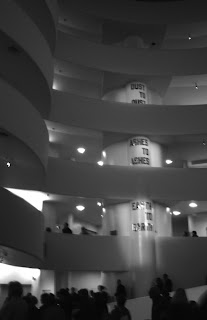
I've never been to the Gugg before, so I was excited. Here's one pic I took inside, looking up. I think this is the pic everyone takes there.

 The place was packed - I've never seen a gallery so busy in all my life. We took in some parts of the permanent collection as well as the exhibition Haunted.

Haunted explored themes of memory, trauma and history through contemporary photography, installation and video. It was haunting alright. The lobby had a sound installation that was both eerie and joyful, while each level walking up the ramp explored various formal and conceptual themes on topics like appropriation, how we record our history, the ties that bind us together and shared experiences. I used the audio tour and I really enjoyed delving deeper into the meaning of some of the conceptual pieces. I was happy to see works by Cindy Sherman, Richard Prince and Robert Mapplethorpe among many others.

Though the show was filled with morbid images like electric chairs, holocaust victims, grave stones and  wax replicas of the deceased, I didn't find the show depressing. Rather I found it to be an interesting comment on the ways that we record our lives and how interconnected our experiences are. There was one piece by a Canadian - a review from artnet.com reads

"One exception [to the dark images] is a suite of color prints by the Canadian artist Sarah Anne Johnson, which manages to make palpable the distance between on-the-ground reality and the kind of imaginary world that we carry around in our heads. Chronicling a kind of summer 4H project [B.C. Tree Planting] where young people worked together to plant trees, the project juxtaposes photos documenting the ignoble aspects of the venture (hard work, dirt, mosquito bites, beer-drinking, hooking up) with ones taken of the artist’s handmade dioramas, in which little painted figurines enact idealistic scenes of people working together and communing with nature, the very stuff of good memories and more. Works like this, uncovering the mechanics of representation and ideology, are always welcome."

After 4 hours killed in the gallery, we realized we were very late for both grabbing dinner and catching our plane. We hightailed it back to our hotel to grab our things. Well, hightailed is one way of putting it. It was rush hour and we had to get off at the Grand Central Station stop. That was an experience and a half. I've done busy subways before, but I've never been so close to someone in public as that trip..it was truly intense. I picked up a tshirt for my bf in the Brooklyn Industries shop in Grand Central because I had promised to replace the I <3 NY tee from last year that disintegrated (what does one expect when one purchases 3 for $10 tees?) and out into the rain we ventured again.

We ate pizzas at Cosi accompanied by unsweet tea, and dilly-dallied so long that by the time we caught our cab and got to the airport, it was 8:05. Our departure was scheduled for 8:25. 

Luckily, our flight was delayed. Home again!


I have a red crock pot. Or "slow cooker" they call them these days. Though it isn't really crock pot season, I've come across four new Proctor Silex cookers that are the most amazing colours. I was immediately reminded of the post I wrote "Pop Life", because these really are a great example of the colour trend. We've seen red and navy blue appliances in recent years - safe, classic colours - and even pink in support of charity. But these are a different animal. The hot tones of tomato red, citric orange, vibrant yellow and chartreuse green are retro inspired and over the top. It is probably for the best that I already have a lovely red crock pot (a housewarming gift from mom) because I wouldn't know which one of these to pick.

Available here.